
Financial literacy
2017 (MIND Research Institute)
Product Type|Collaborative Classroom Experience
Role|Visual Design, motion graphics & animation
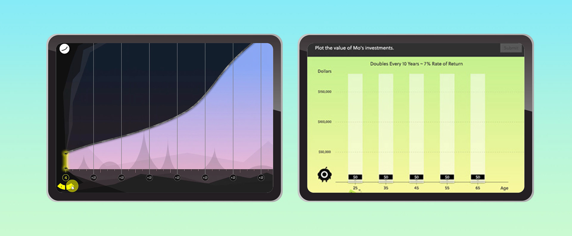
The first financial literacy curriculum carries on the proven ST Math approach while featuring a brand new visual direction and a storytelling classroom experience. This project introduced an interactive and collaborative classroom model that features narrative-driven animations and teacher-student game activities to help transform learning essential financial concepts.
Demo video showcase overall visual design
This project sought a new experience and showcased a unique visual treatment that ties to the cleanliness and simplicity of the main product ST Math, but also brings an uplifting, modern, and distinguished look.
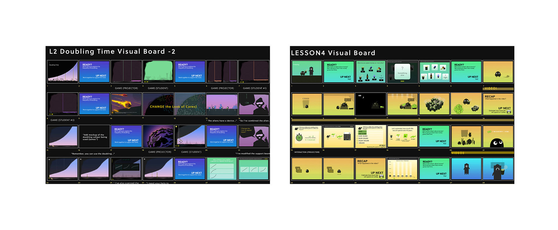
Lead and develop visual direction, create engaging animated videos, and design lecture slides. I collaborated with a UX designer and an interactive designer to explore and create a new visual approach that brings simplicity and minimizes distraction for students while keeping them engaged in learning.
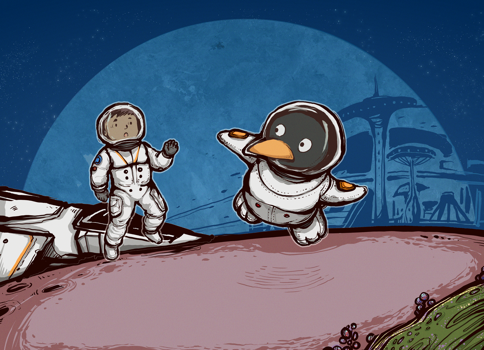
The setting was a space theme with comic and storytelling elements. We started with concept sketches, character development, and background sketches to explore potential styles and color schemes. We went from black and white comic style to different color combinations and gradient colors, then picked the one that best fit our story and continued to expand from there.
Initial concept illustration to catch the feeling of the story in a comic style.
Character design and color Exploration #1
Character design and color Exploration #2
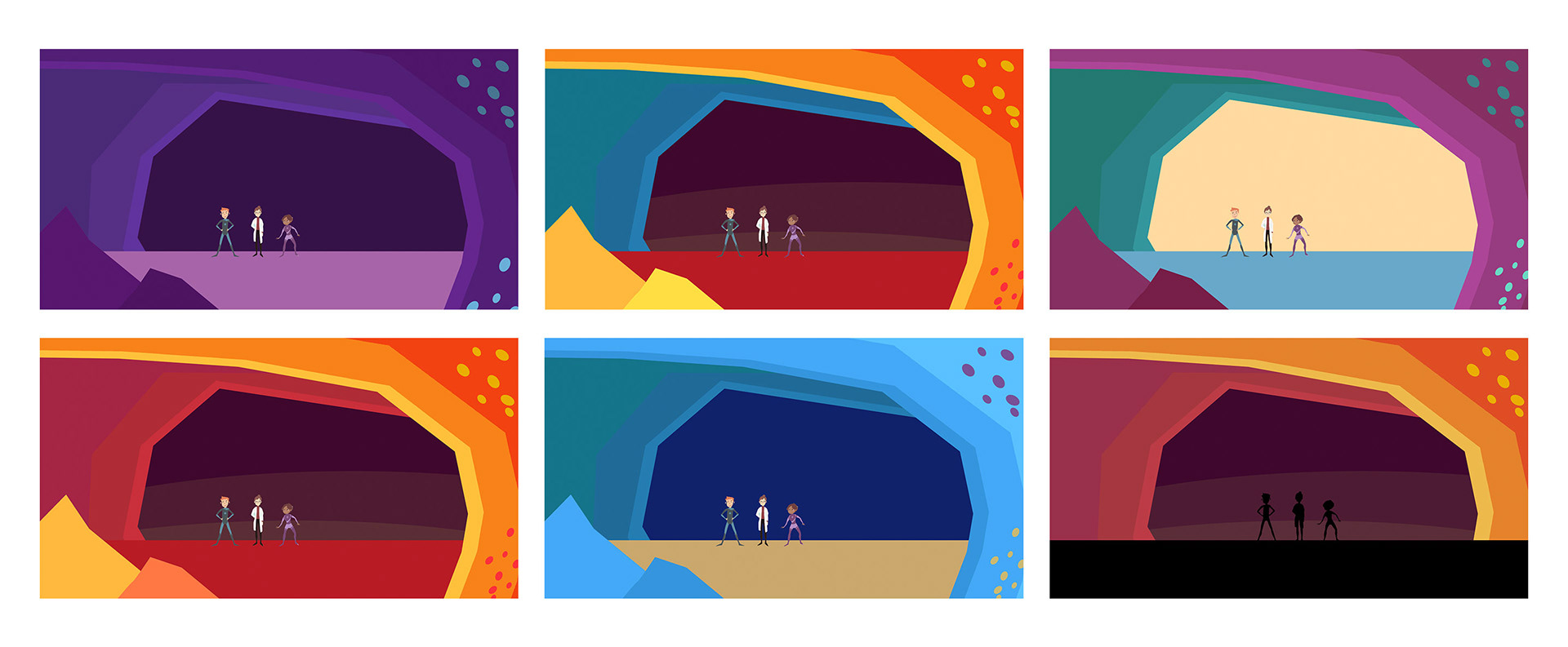
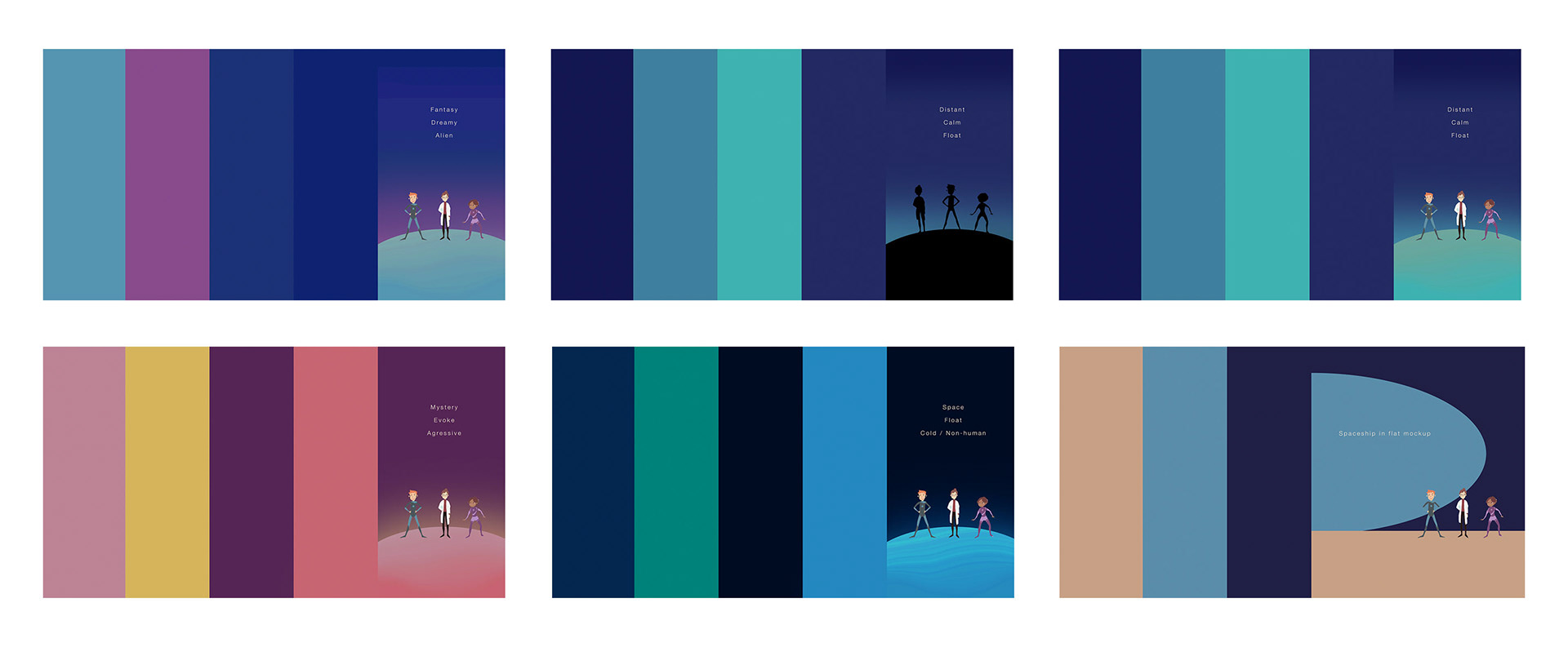
Gradient color had been roughly used in the original ST Math games. We decided to push it further and extend it to a fresher visual language. We came up with different gradient color combinations and decided on a few functional ones to serve different lecture purposes while distinguishing different types of lecturing content. We also decided to use a silhouette style to minimize the distraction of characters and use shapes to communicate.
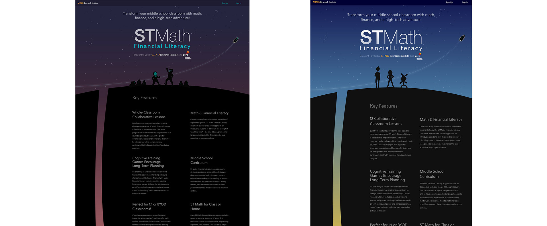
Financial Literacy initial Website mockup
Mockup using different gradient colors to separate learning content
The aliens on the planet are the main critters that appear in this project and are significantly more important than human characters. In the second part of the lecture, two aliens Mo and Zee use their story to help students compare and understand the difference between investing habits. We played around with some features of the characters and made them more obvious to distinguish each other, including shape, poses, sizes, etc.

PROGRAM USED
Photoshop | Animate | Premiere